
2024
UX / UI Design
CST 379 Interactive and Experiential Media


I co-led our group for this project and contributed a range of design solutions that improved the clarity and usability of our prototyped website. While my group members handled broader structural decisions, I focused closely on the detailed branding elements that often go unnoticed but are essential for creating a clean, cohesive, and professional final product. My previous coursework and project experience prepared me well for this role. In Fall 2023, I completed a course in Digital Content Writing, Strategy, and Experience Design, where I learned to apply uses and gratifications theory to website-building and user experience. This background, paired with my digital art and design minor, allowed me to bring an artistic perspective to elements that were missing from the original design. Overall, I’m extremely proud of the work we accomplished together and the final product we produced.
UX Case Study
To understand the specific challenges users encountered on the website, we first identified our target audience and conducted interviews to gather insight into their needs. We interviewed and observed six students who were either interested in education abroad or preparing for an upcoming trip.
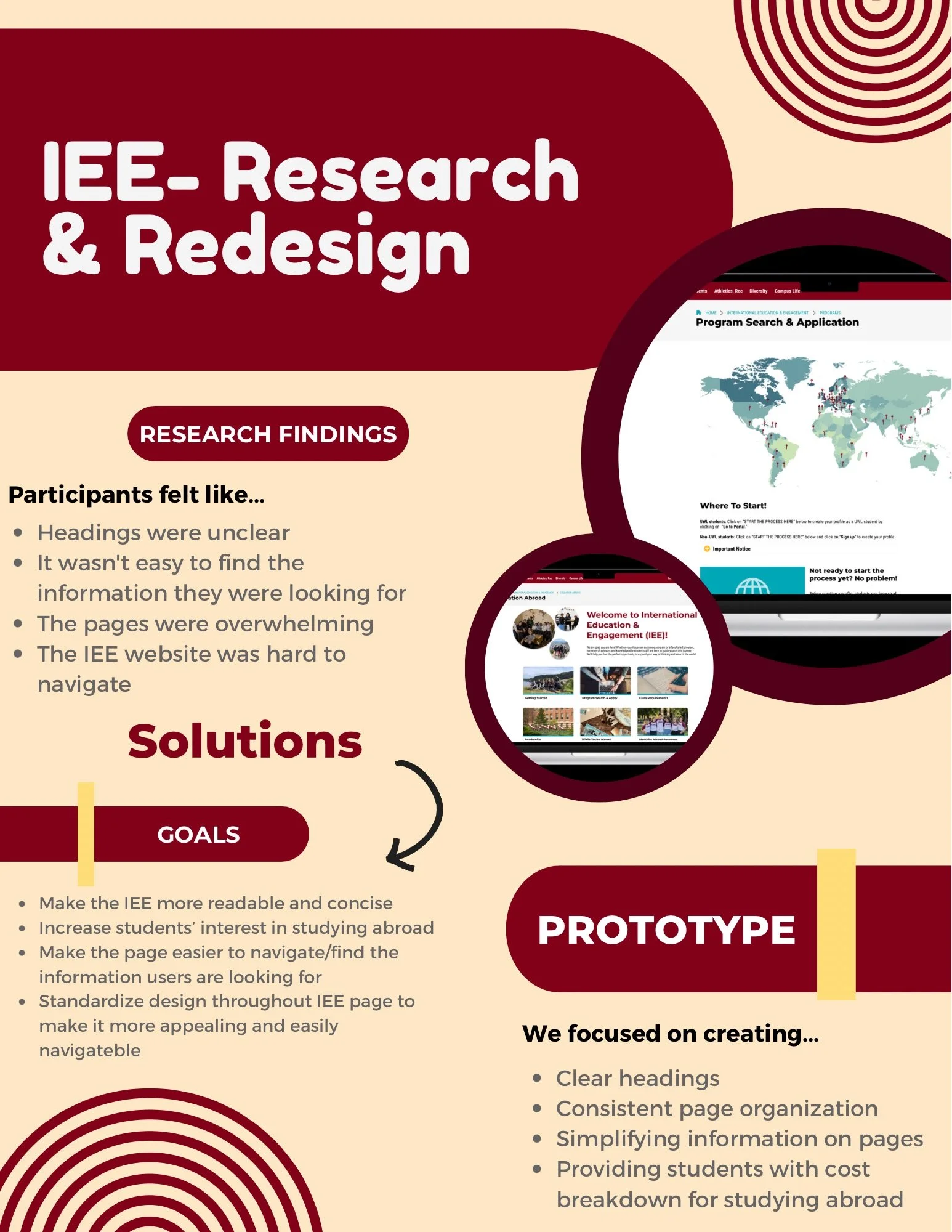
Across these interviews, a shared set of issues emerged. Users consistently described feeling overwhelmed by the amount of information presented on the International Education and Engagement (IEE) main page. The heavy content load created visual clutter, which often caused users to exit pages prematurely or overlook important information. Additionally, ambiguous page titles led to confusion about where certain content was located, resulting in inefficient navigation.
While addressing these challenges, our group remained committed to preserving a sense of familiarity for users. We kept the prototype visually consistent with the original website to reduce confusion and support easy recognition. The redesigned prototype maintains familiar conventions while organizing previously hidden or scattered information in clearer, more accessible ways. These changes help reduce user stress and create a more seamless, intuitive browsing experience.
Design Process Documentation
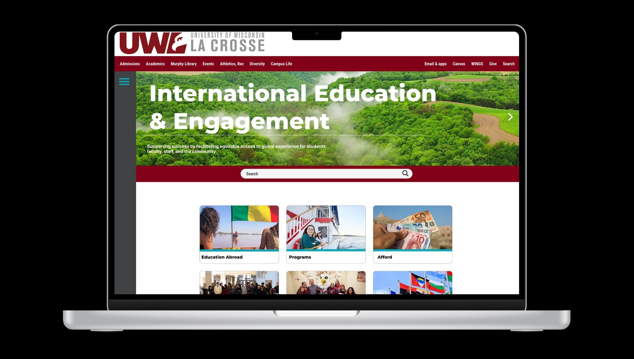
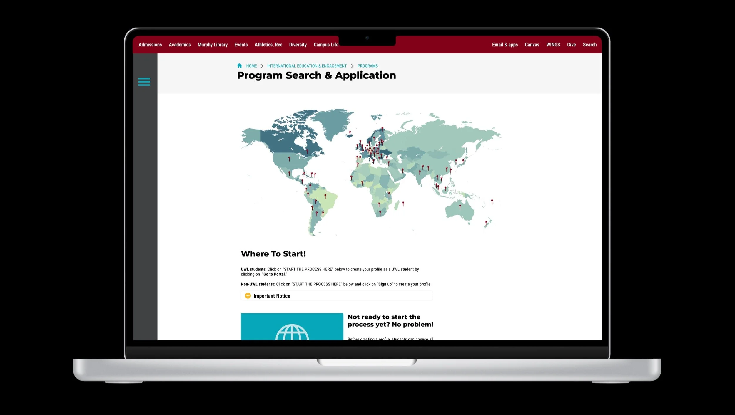
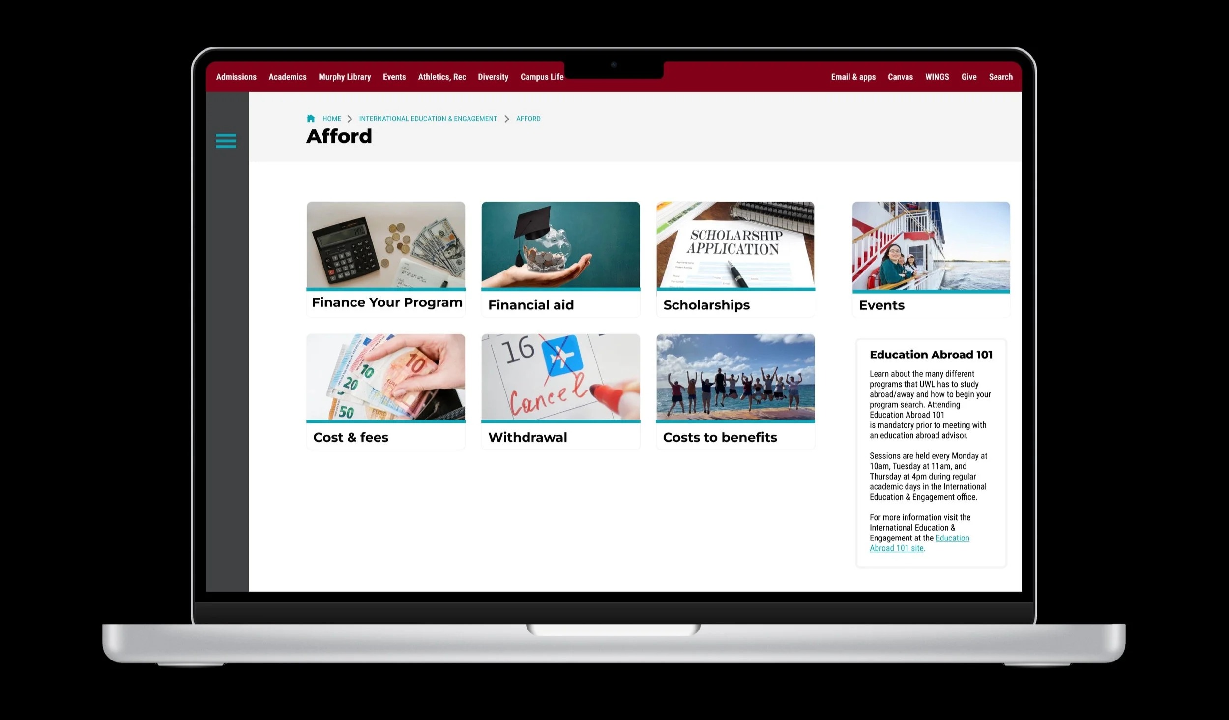
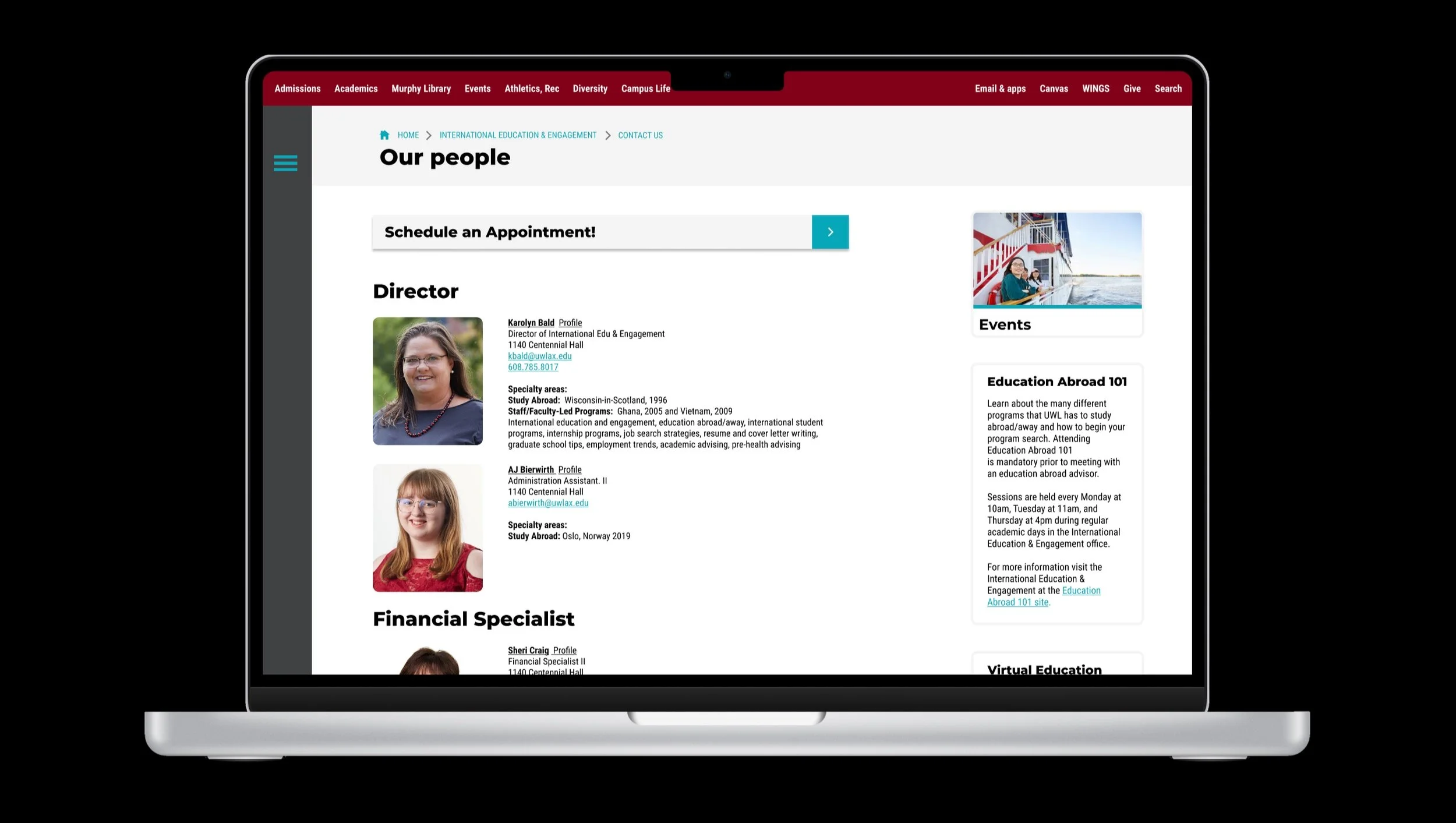
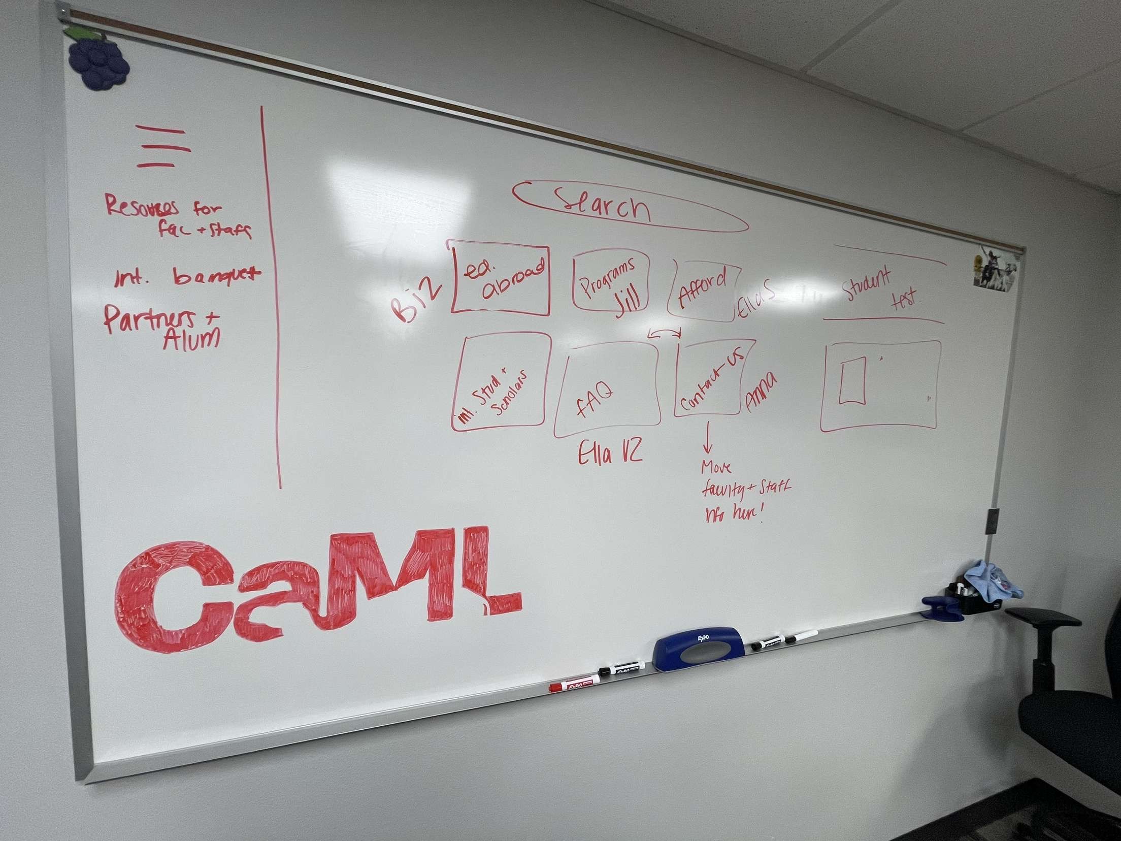
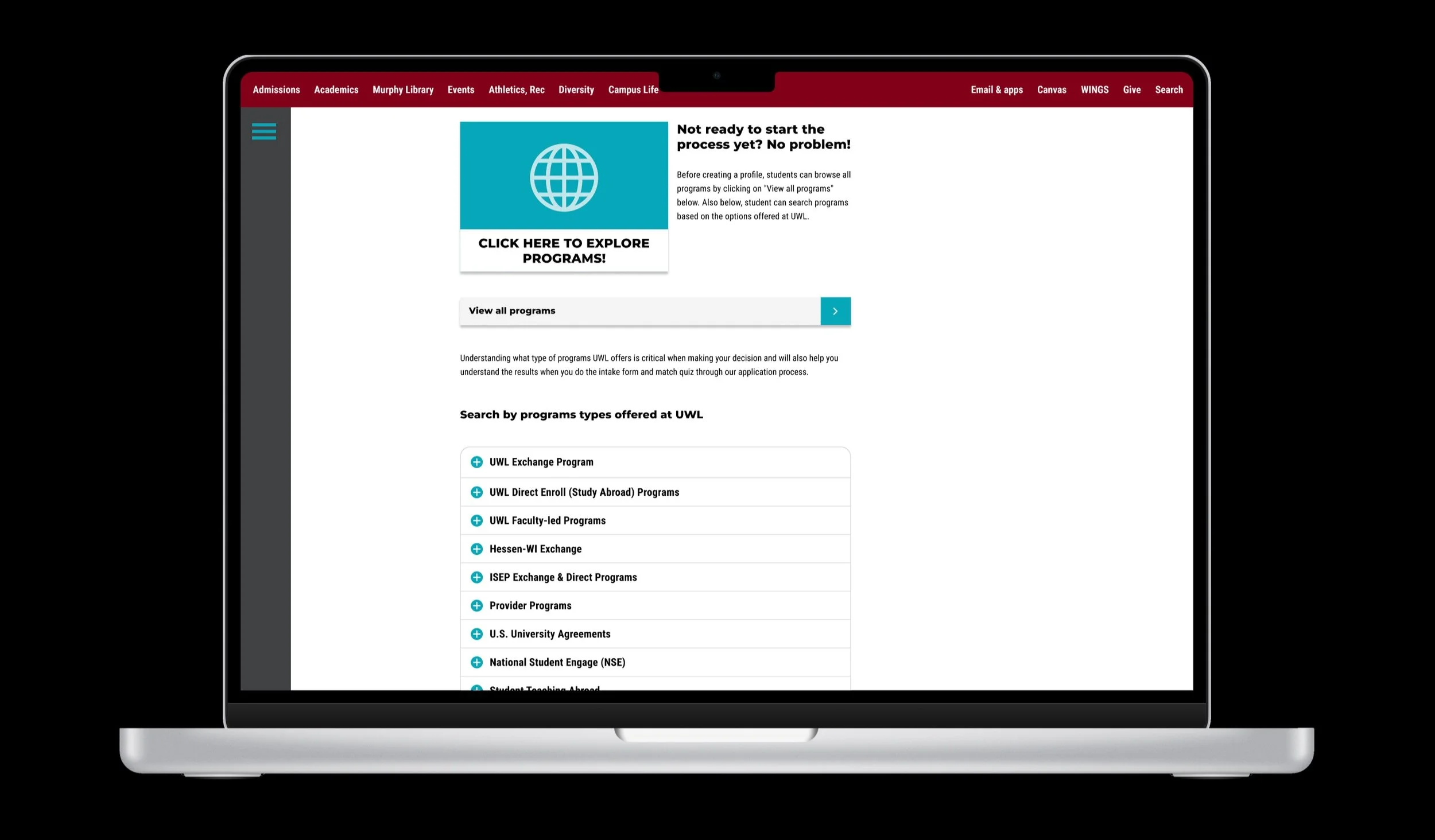
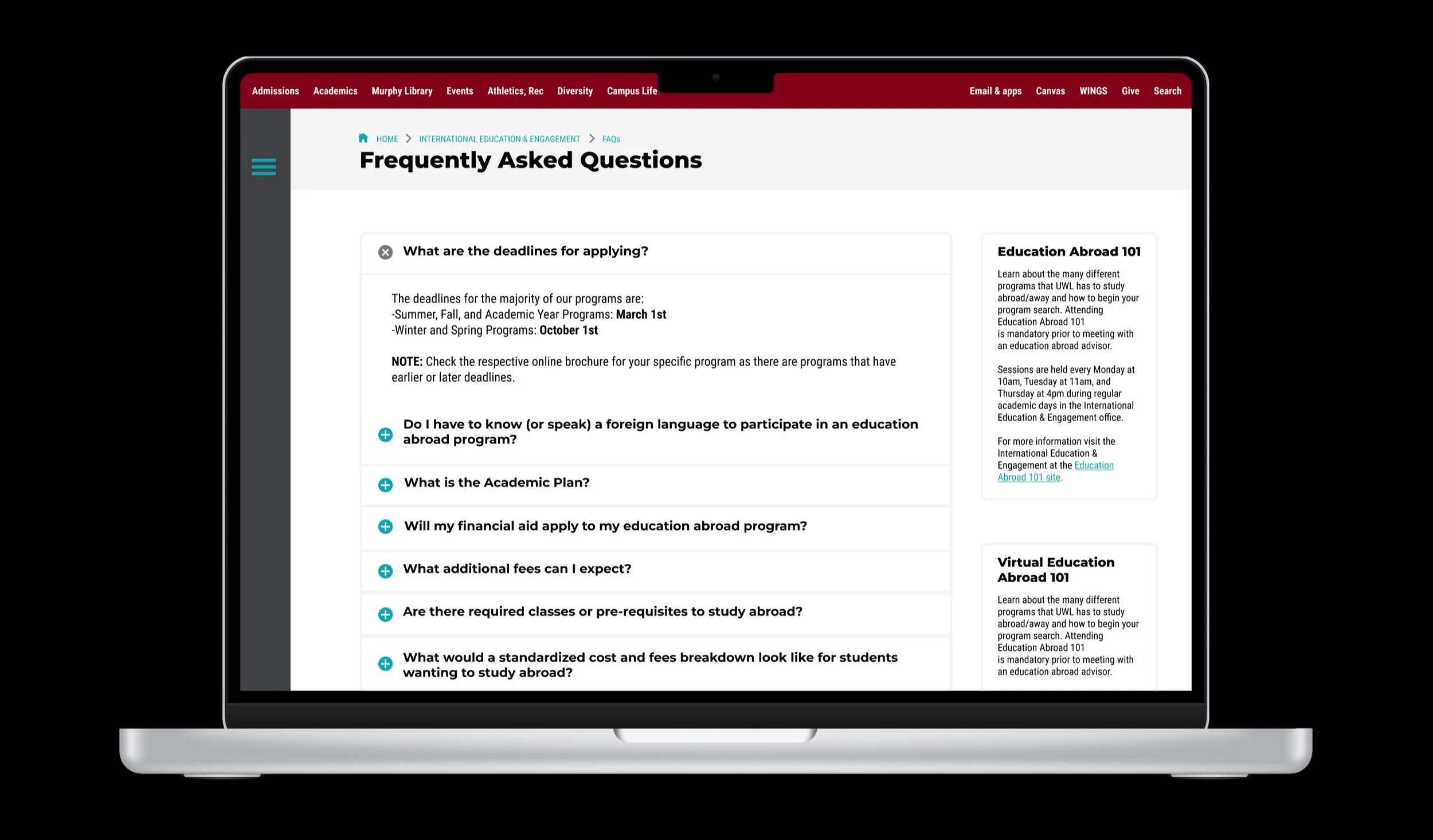
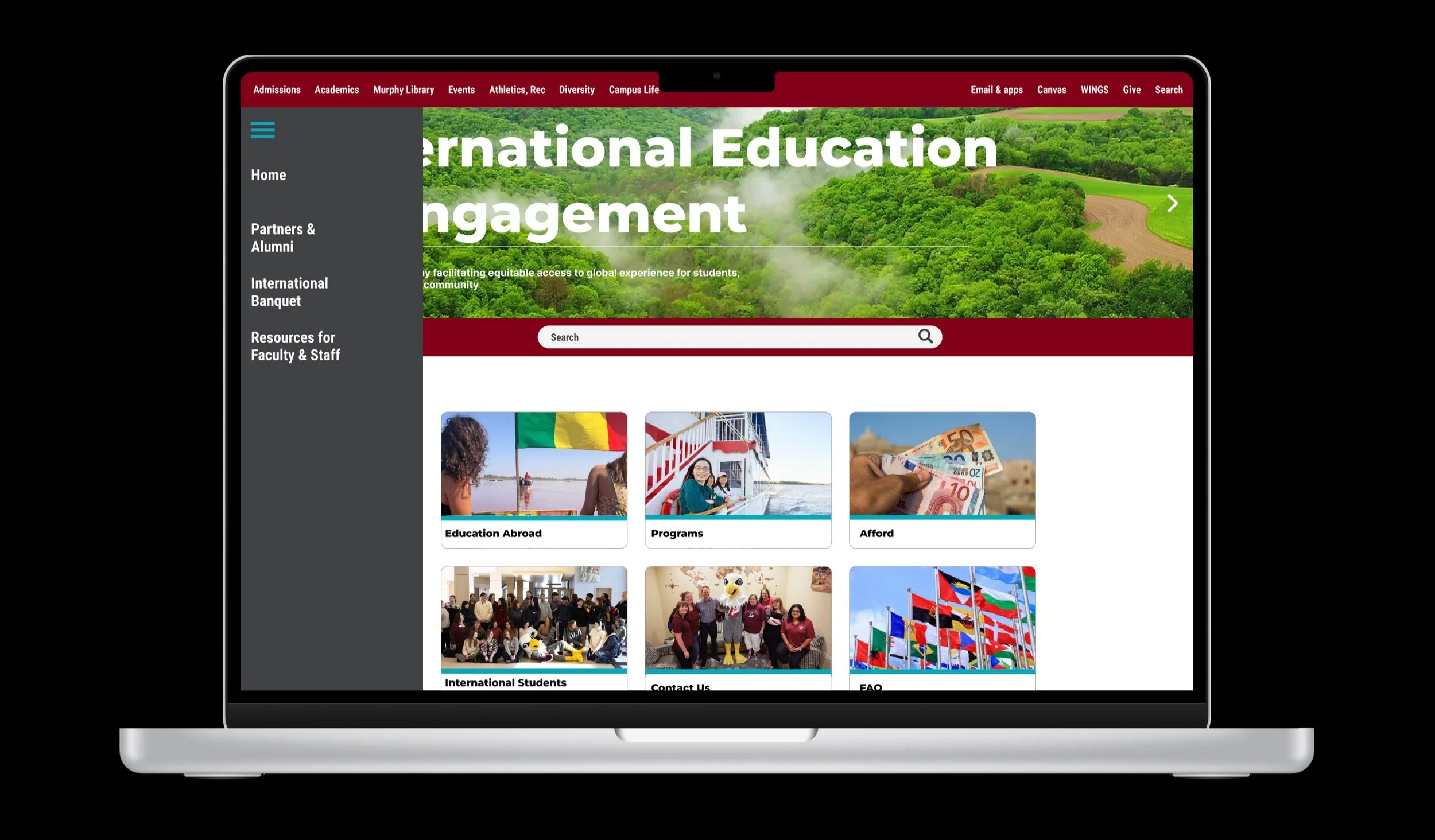
We began by focusing on the IEE homepage. Our goal was to maintain the original structure while improving clarity through more descriptive and user-friendly headline wording. Pages that were not essential for our primary user group were relocated to the hamburger menu—still accessible, but no longer cluttering the main interface. This allowed us to highlight the content users most frequently search for.
Each group member was assigned an internal page requiring redesign. Guided by our user feedback, we implemented a consistent layout featuring clickable content boxes that preview what users will find inside each section. We also added drop-down menus to house supplemental information that had previously contributed to visual overload. These design decisions reduce unnecessary searching and present content in a cleaner, more digestible way.


Professional Development
This project gave me valuable insight into user expectations regarding accessibility and information delivery. As users increasingly expect immediate, clear access to information, designers must adapt to these needs and apply relevant heuristics to remain aligned with modern web standards. The experience I gained here has prepared me to approach future research and design work with greater confidence and intention.
I also completed my CITI Training certification, which equips me to conduct ethical research—an essential component of user-centered design projects like this one. Working with Figma for the first time was a rewarding challenge. The learning curve was noticeable, but with practice, our team was able to build the prototype exactly as we envisioned it.
Collaborating closely with a group was both a challenge and a strength of the project. Navigating different communication styles and aligning our shared goals required open conversation and flexibility. Establishing a unified vision early on made the entire process smoother. Looking back, I’m proud not only of the final prototype, but of the way we worked together to combine each of our strengths into a cohesive and meaningful design.